Data Science & Visualization
Making performance visible — so decisions get easier.
Dashboards & Data Visualization
Interactive dashboards that surface what matters — recent deliverables include school performance dashboards used by educators and administrators to track outcomes at a glance.
Statistical Analysis
Rigorous statistical methods applied to your organization's questions — from significance testing to forecasting and trend analysis.
Recent deliverables
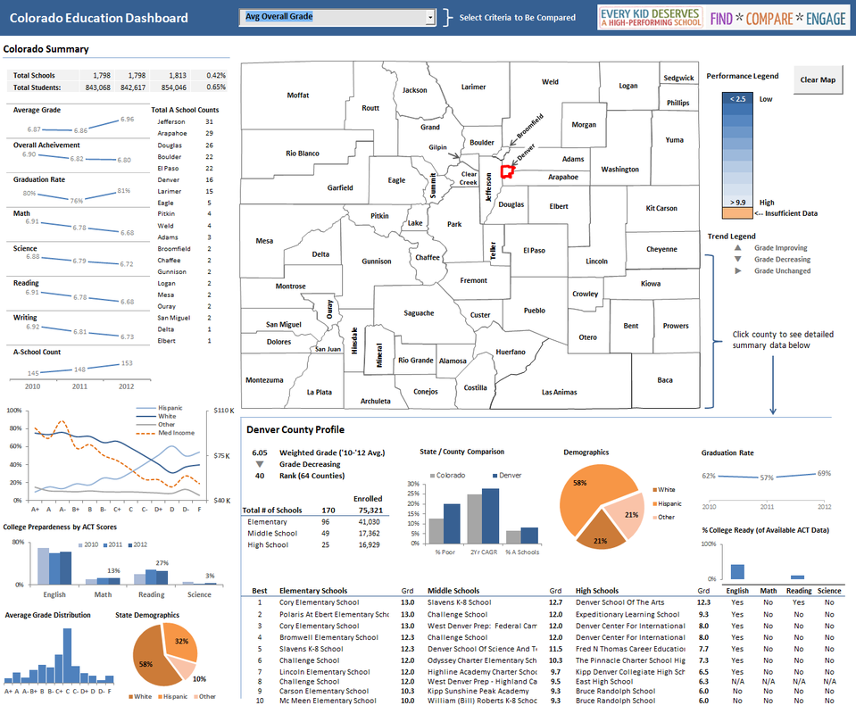
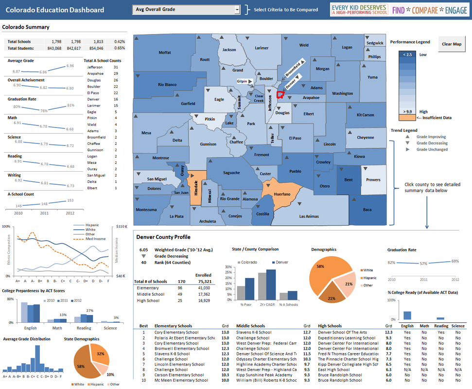
The Colorado Education Dashboard — an interactive statewide view of school performance built for the "Every Kid Deserves a High-Performing School" initiative. County-level drill-downs, demographic and ACT-readiness profiles, and trend indicators across 1,798 schools and 843,000 students.
Why visualization matters
Our favorite illustration is Charles Minard's famous 1812 graphic portraying the losses suffered by Napoleon's army in the Russian campaign. A single thick band shows the army's size at each position on the march; a darker band, tied to temperature and time scales, traces the retreat from Moscow. It is widely considered among the best statistical graphics ever drawn — six dimensions of data, one unforgettable picture. That's the standard we aim for: visuals that make the story of your data impossible to miss.